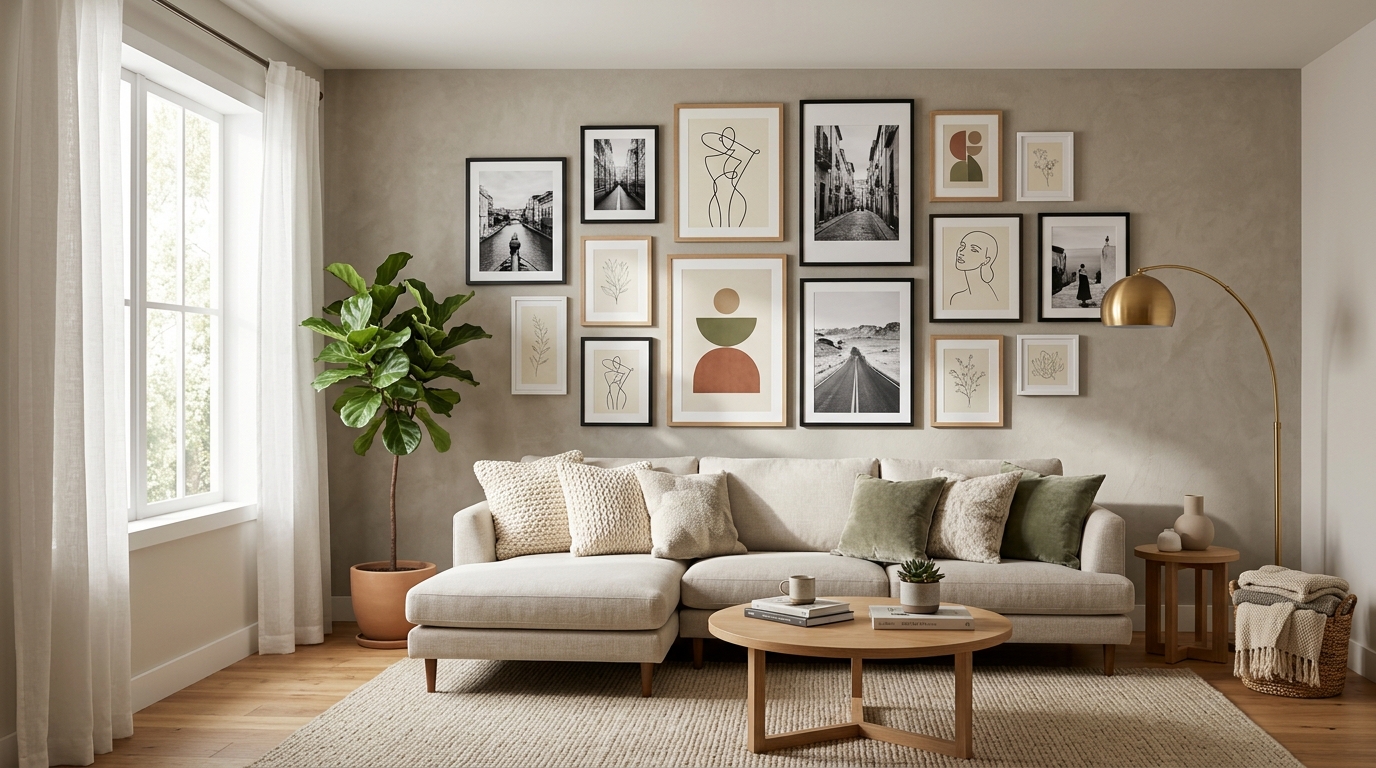
Most gallery walls look like someone panicked halfway through and started nailing things. The frames are too small, the spacing is inconsistent, the prints have no relationship to each other, and the whole arrangement reads as decoration that happened rather than decoration that was planned. A gallery wall that actually works is one of the most impressive things in a living room, and the difference between one that works and one that does not is almost entirely in the decisions made before a single nail goes in the wall.
These gallery wall ideas for living room spaces focus on what makes an arrangement successful: frame choices that create cohesion, layout approaches that suit different wall sizes and shapes, print mixing strategies that give the wall a visual logic, and specific techniques that produce the finished, gallery-quality result that most people are aiming for and rarely achieve. No furniture advice, no lighting suggestions, no pillow combinations. Just the gallery wall itself, planned and executed correctly.
You will find 15 ideas here, each one a distinct approach to a specific gallery wall decision or challenge. Some ideas apply before the first print is chosen. Some apply on the day of installation. All of them make the difference between a gallery wall that looks considered and one that looks like it is still in progress.
1. Start with One Anchor Piece Significantly Larger Than Everything Else
A gallery wall without an anchor piece reads as a collection of equally weighted items with no clear focal point or hierarchy. The eye moves across the arrangement without settling, which creates a restless quality that makes the wall feel busy rather than composed. An anchor piece at least twice the size of the next largest frame gives the wall a center of gravity that every other piece can organize around.
Choose the anchor piece first and size everything else in relation to it. For a wall above a standard sofa, an anchor piece at 18 by 24 inches or 20 by 30 inches reads correctly as the dominant element. Place the anchor slightly left or right of the wall’s center rather than perfectly centered, which creates a more dynamic arrangement than symmetrical placement. Build the remaining frames outward from the anchor in descending order of size so the arrangement feels like it grew from a single point rather than was assembled from multiple independent pieces.
2. Gallery Wall Ideas for Living Room Layouts Require a Floor Plan First
The most common gallery wall mistake is hanging the first piece and building from there without any plan. The result is an arrangement that grew without direction. Before a single nail goes in the wall, lay every frame and print on the floor in the approximate dimensions of the target wall area and arrange them until the composition looks right from standing height above the layout.
Trace each frame onto kraft paper or newspaper, cut out the paper silhouettes, and tape them to the wall with painter’s tape before committing to any nail holes. Step back to the main viewing position in the room, which is typically the sofa or the entry of the living room, and evaluate the arrangement from 8 to 12 feet away. Adjust the paper templates until the composition reads clearly from that distance. What looks wrong on the floor often looks completely different at wall height and from the actual viewing distance of the room.
3. Use One Consistent Frame Finish Throughout the Arrangement
A gallery wall with multiple frame finishes, some black, some gold, some natural wood, some white, reads as a collection of separate purchases made without reference to each other. One consistent frame finish throughout the arrangement, even with varied frame styles and sizes, produces a visual cohesion that makes the gallery wall read as designed rather than accumulated.
Choose a single finish and apply it to every frame in the arrangement: all matte black, all thin natural oak, all aged gold, or all white. The frames themselves can vary in style, some rounded, some with decorative profiles, some simple and minimal, as long as the finish is consistent. This rule does not prevent visual interest within the arrangement. It simply ensures that the frame finish reads as a coordinated decision rather than a series of independent choices. The Ribba Frame collection at Target, the Threshold Gallery Frames, and the Umbra Trigg Frames all carry consistent finish options across multiple sizes.
4. Mix Three Print Sizes for Visual Rhythm in the Arrangement
An arrangement of prints that are all the same size reads as a grid, which has a formal, institutional quality that suits specific design directions but limits the organic, gallery quality that most living room walls are aiming for. Three distinct size categories in the arrangement, large anchor pieces, medium supporting pieces, and small accent pieces, create a visual rhythm that leads the eye through the wall in a natural sequence.
The three-size approach uses a ratio of roughly one third large, one third medium, and one third small pieces distributed across the arrangement. Large pieces at 16 by 20 inches or above. Medium pieces at 8 by 10 to 11 by 14 inches. Small pieces at 5 by 7 or 4 by 6 inches. Cluster the small pieces together near the large anchor rather than distributing them evenly, which creates a sense of density and focal interest rather than spreading the visual weight across the full arrangement without concentration.
5. Gallery Wall Ideas for Living Room Spaces Work Best with a Unifying Print Theme
Prints that have no visual relationship to each other, a landscape photograph beside a typographic print beside a floral illustration beside an abstract shape, create a wall that reads as eclectic to the point of incoherence. A unifying theme across the prints, whether a subject theme like botanicals or architecture, a color theme where all prints share one or two tones, or a stylistic theme where all prints are in the same artistic medium, gives the wall a visual logic that reads immediately from across the room.
Choose the theme before selecting the prints rather than choosing prints and hoping a theme emerges. Botanical line drawings in black and white on cream paper from Desenio or Society6 produce a cohesive print theme with natural variation in the individual illustrations. Black and white photography of a consistent subject, city architecture, natural landscapes, or abstract forms, creates a theme with tonal consistency across all the pieces. Minted and Artifact Uprising both carry curated print collections in consistent stylistic families that make theme selection simple.
6. Leave Two to Three Inches Between Every Frame
The spacing between frames in a gallery wall determines whether the arrangement reads as a composed collection or a crowded surface. Too little space and the frames compete with each other for visual attention. Too much space and the arrangement reads as individual pieces scattered rather than a unified gallery.
Two to three inches between frames is the standard spacing that most professional gallery installations use because it creates a clear separation between pieces without enough gap for the spaces to read as significant negative space. Measure the spacing with a ruler rather than eyeballing it, and keep it consistent throughout the entire arrangement. Inconsistent spacing is one of the most visible flaws in a gallery wall from the main viewing distance because the eye notices the irregular gaps immediately even when it cannot identify what is wrong.
7. Build a Salon-Style Floor-to-Ceiling Arrangement for Maximum Impact
A salon-style gallery wall covers the wall surface from just above floor level to near ceiling height with overlapping frames in varying sizes arranged without strict rows or columns. This is the most theatrical and most visually impressive gallery wall approach available because the density of the arrangement and the full-height coverage creates the impression of a room that has been carefully considered over a long period rather than recently decorated.
Start with the largest pieces at eye level and build upward and downward from there. The pieces at ceiling level and near the floor can be smaller because they are seen at a greater distance from the main viewing position. Keep the spacing tighter in a salon arrangement, 1.5 to 2 inches between frames, which creates the density that defines the style. A salon wall requires committing to the arrangement before hanging anything because adjustments after the fact require moving multiple pieces to accommodate a single change.
8. Create a Grid Gallery Wall with Identical Frames and Prints
Nine or twelve identical frames hung in a precise grid with perfectly even spacing between each row and column creates one of the most graphic, architectural gallery wall approaches available. The visual power of the grid arrangement comes from its mathematical precision: when the spacing is perfectly even and every frame is identical, the arrangement reads as a single composed piece rather than a collection of individual items.
Use frames of the same exact model in the same exact finish and hang them with equal gaps between each row and column using a laser level for horizontal precision and a ruler for consistent spacing. A 3 by 3 grid of 8 by 10 inch frames with 3 inches between each frame spans approximately 39 inches wide and 39 inches tall, which suits a wall above a standard sofa. Print all nine images in the same finish, all matte or all glossy, from Mpix or a local print lab for tonal consistency across the full grid.
9. Gallery Wall Ideas for Living Room Arrangements Use the Sofa as the Anchor Reference
A gallery wall above a sofa that is too high, too low, or misaligned with the sofa width reads as disconnected from the furniture below it. The gallery wall and the sofa should read as a composed unit from across the room, which requires the bottom edge of the gallery arrangement to sit at the right height relative to the sofa back and the full arrangement to span proportionally in relation to the sofa width.
Hang the lowest frame in the gallery arrangement approximately 8 to 10 inches above the sofa back. This is the gap that reads correctly from across the room as a connected relationship between the wall arrangement and the furniture below it. The full arrangement should span between two thirds and the full width of the sofa, not wider, so the wall and the sofa read as one composed zone rather than the wall art overhanging the furniture on the sides.
10. Use a Picture Ledge for a Flexible, No-Hole Gallery Display
A picture ledge is a shallow shelf with a front lip that holds frames upright without hanging hardware. Frames lean against the wall on the ledge and can be swapped, rearranged, and updated without touching the wall again after the initial ledge installation. For a gallery wall approach that stays flexible, picture ledges provide the full visual effect of a gallery arrangement with none of the commitment of individual frame placement.
Install two to four picture ledges at staggered heights and lean frames of different sizes against each other in overlapping layers on each ledge. The layered, leaning arrangement on picture ledges is one of the most photographed gallery wall approaches on Pinterest specifically because it looks deliberately casual and easy to update. The West Elm Picture Ledge in white oak at 36 inches, the Pottery Barn Gallery Frame Ledge, and the Target Brightroom Picture Ledge all provide the right combination of depth and front lip height for stable frame display in varying sizes.
11. Mix Framed Art with Three-Dimensional Objects in the Arrangement
A gallery wall composed entirely of flat framed pieces reads as a two-dimensional surface regardless of how well the composition is planned. Introducing three-dimensional elements, a small shelf with an object on it, a ceramic wall-mounted piece, a woven textile panel, or a mounted clock within the arrangement, adds physical depth to the wall surface and creates a more complex, interesting gallery quality.
Add one small floating shelf to the arrangement that holds a single object: a ceramic bud vase, a small sculpture, or a meaningful small item that relates to the print themes around it. Mount a wall-hanging textile or a woven piece in a round or rectangular form within the arrangement as an alternative to a framed piece in that position. The three-dimensional elements should occupy no more than 20 percent of the total arrangement area so the framed pieces remain the primary visual element and the three-dimensional additions read as considered accents rather than competing interruptions.
12. Gallery Wall Ideas for Living Room Walls Include a Black and White Only Approach
A gallery wall composed entirely of black and white prints in black frames on a white or light wall creates the most graphic, high-contrast gallery effect available and suits any living room design direction because it introduces no competing color. The black and white approach is also the most forgiving for print mixing because the absence of color removes the most common source of visual conflict between different prints.
Print a personal photograph series in black and white, download vintage maps or botanical illustrations in grayscale from the Biodiversity Heritage Library, mix black and white photography with pen-and-ink architectural drawings, and layer abstract black and white shapes alongside portrait photographs. The only rule is that every print stays entirely monochrome. The Mpix Glossy Metallic Print service produces black and white prints with exceptional tonal depth that suits the high-contrast approach specifically.
13. Use Washi Tape or Painter’s Tape to Plan the Layout Before Committing
The full layout planning technique goes further than tracing paper silhouettes. Use washi tape or 1-inch painter’s tape directly on the wall to mark every frame outline, including the spacing between frames, before drilling a single hole. This allows the full arrangement to be seen at scale and in position, with the actual wall surface visible, before any permanent marks are made.
Apply tape rectangles in the exact dimensions of each frame, spacing them the planned 2 to 3 inches apart, and step back to evaluate the full arrangement from the room’s main viewing position. Live with the tape layout for a day before hanging. What looks correct immediately after taping sometimes reads differently after 24 hours and a fresh set of eyes. Adjusting tape takes seconds. Moving incorrectly placed nail holes requires patching and repainting.
14. Choose Prints That Share at Least One Color Across the Arrangement
A mixed print gallery wall with prints that share no common color reads as visually noisy from across the room because the eye jumps between unrelated color fields rather than following a visual path through the arrangement. Prints that share at least one color tone, even if the prints themselves are stylistically different, read as a cohesive collection because the repeated color creates a visual thread that connects the pieces.
Choose the shared color first and source prints that include it. Dusty terracotta as the connecting tone through a mixed botanical, abstract, and portrait arrangement. Warm cream and ivory backgrounds across prints of different subjects. A consistent navy blue as an accent tone present in each print even when the primary subjects differ. Society6 and Minted both allow searching by color palette, which makes finding prints that share a specific tone significantly easier than browsing without a color filter.
15. Gallery Wall Ideas for Living Room Installations Need Center-Point Hanging
The center-point hanging method is the most reliable technique for placing individual frames precisely within a composed gallery arrangement. Rather than measuring from the top of the frame to find the nail position, measure from the center of the frame to the hanging wire at its tightest point and subtract that distance from the center-point height of where the frame should hang. This places the center of the frame exactly at the planned position regardless of the frame’s hanging hardware configuration.
Mark the center-point position for each frame on the wall with a small pencil mark rather than a nail hole so adjustments are easy before drilling. Use the same technique for every frame in the arrangement so all positions are calculated from the same reference point. A laser level ensures horizontal accuracy across the full arrangement, which is particularly important in a mixed-size gallery wall where rows are not strict and the eye is more likely to notice when pieces are even slightly off level from each other.
Conclusion
A gallery wall done right is one of the few decorating projects that actually gets better over time. As new prints are added and old ones are swapped out, as the arrangement shifts slightly with each addition, the wall develops a character that no single curated purchase produces. It starts looking like it belongs to someone.
The most important thing to do before any of these ideas is to plan on the floor before touching the wall. Every hour spent arranging paper templates saves an hour of patching and repainting from misplaced holes. Get the composition right at floor level, transfer it to the wall with tape, live with it for a day, and then hang. These gallery wall ideas for living room spaces give you the framework for every decision from the first print to the last nail.