Color is the decision in a kitchen remodel that you live with every single day and the one that most people second guess the longest after the fact. A wrong paint color on a bedroom wall is easy to fix. A wrong cabinet color with a wrong countertop on top of it is a five figure mistake that stays with you for a decade. These 18 kitchen remodel color combo ideas take the guesswork out of that decision by giving you proven combinations that work across different kitchen styles, lighting conditions, and personal aesthetics.
Every combo here is specific enough to actually use and grounded in how colors interact with each other in a real kitchen rather than on a paint chip. Below are 18 color combinations that make kitchen remodels look genuinely considered and designed.
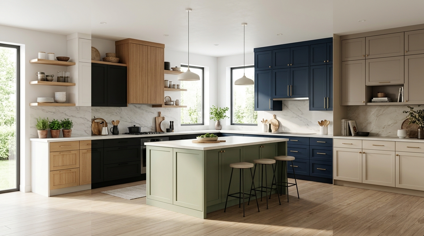
1. White Cabinets with Sage Green Island and Warm Wood Accents
White perimeter cabinets paired with a sage green island is one of the most popular and most consistently successful kitchen color combinations of the current decade and it works because the cool white and the muted organic green occupy opposite ends of the calm neutral spectrum without creating any tension between them. The white cabinets keep the kitchen light and open while the sage island provides a visual anchor that gives the space depth and warmth without darkening it. Warm wood accents in open shelving, bar stools, or floating shelf brackets tie the two colors together through a shared organic quality.
Benjamin Moore Saybrook Sage, Sherwin Williams Rosemary, and Farrow and Ball Mizzle are all sage greens that work beautifully on an island against white perimeter cabinets. Keep the countertop in a warm white or cream quartz with subtle veining rather than a stark bright white to maintain the warmth the combination depends on. The wood accents should be in a light to medium tone, white oak or maple rather than dark walnut, to keep the palette feeling airy rather than heavy.
2. Navy Cabinets with Brass Hardware and White Marble Countertops
Navy cabinet with brass hardware and white marble countertop is the kitchen color combination that defined the premium remodel market for the better part of a decade and it continues to work because the contrast between the deep cool navy and the warm metallic brass is genuinely beautiful and the white marble grounds both with a neutral that suits them equally well. The combination reads as classic and confident rather than trendy and it holds its quality over time in a way that combinations built around more fashion forward colors do not.
Benjamin Moore Hale Navy and Sherwin Williams Naval are both proven cabinet navies that look rich without reading as black in lower light conditions. Unlacquered brass hardware develops a natural patina over time that makes the combination feel more established and considered as the kitchen ages. A white Carrara marble or Calacatta quartz countertop completes the combination with a material that bridges the navy and brass through the cool white ground and warm gold veining that both colors find a relationship with.
3. Greige Cabinets with Black Hardware and Concrete Countertops
Greige, the warm beige gray that has become one of the most reliable neutral cabinet colors available, paired with matte black hardware and a concrete or concrete look countertop creates a kitchen with an industrial warmth that suits contemporary, transitional, and modern farmhouse styles equally well. The greige cabinet color is warm enough to prevent the kitchen from feeling cold despite the industrial material palette and the black hardware and concrete countertop give the combination enough edge to feel current and considered.
Sherwin Williams Accessible Beige, Benjamin Moore Revere Pewter, and Sherwin Williams Agreeable Gray are all greige cabinet colors that work with this combination. Matte black hardware in a simple bar pull or cup pull form keeps the industrial quality clean rather than decorative. A polished concrete countertop or a concrete look quartz from Silestone in a warm gray tone completes the combination with a surface that suits the material language of the rest of the palette.
4. Forest Green Cabinets with Unlacquered Brass and Creamy White Countertops
Forest green cabinets with unlacquered brass hardware and a creamy white countertop is a combination that reads as deeply saturated, warm, and completely current. The richness of the green, a color with genuine depth and complexity unlike the more muted sage tones, creates a kitchen with a strong personality and the unlacquered brass hardware picks up the organic, slightly aged quality that green and brass share when placed together. The creamy white countertop prevents the combination from becoming too dark or heavy by reflecting light back into the green cabinetry.
Farrow and Ball Calke Green, Benjamin Moore Hunter Green, and Sherwin Williams Shade Grown are all forest greens with the right depth and warmth for a full cabinet application. Use the creamy white countertop in a material with some warmth to it, a cream quartz with subtle warm veining or a honed white limestone rather than a bright cool white, to maintain the warmth the combination depends on. Pair with natural wood flooring in a medium tone to complete the organic, considered quality of the palette.
5. All White Kitchen with Black Accents and Natural Wood Open Shelving
A fully white kitchen with black accents and natural wood open shelving is the cleanest and most versatile kitchen color approach available and it works across every kitchen size, style, and lighting condition without exception. The white creates maximum light reflection and a sense of space, the black accents in hardware, faucet, light fixtures, and window frames provide definition and prevent the white from reading as flat or featureless, and the natural wood open shelving introduces warmth and organic texture that keeps the combination from feeling clinical.
The critical decision in an all white kitchen is the specific white chosen for the cabinets and the specific white chosen for the walls and whether those two whites work together or create an awkward near miss. A warm white on the cabinets like Benjamin Moore Chantilly Lace or Sherwin Williams Extra White should be paired with a wall color in the same warm white family rather than a cooler white that makes the cabinet color look yellow by comparison. The wood shelving should be in a light natural tone, white oak, maple, or ash, to complement rather than compete with the warmth of the white cabinet selection.
6. Charcoal Lower Cabinets with White Upper Cabinets and Warm Brass Hardware
Two tone cabinetry with charcoal lower cabinets and white upper cabinets is a combination that gives a kitchen visual weight at the base while maintaining the lightness and openness of a white kitchen above the counter line. The charcoal grounds the kitchen and makes the lower cabinet zone feel substantial and considered while the white uppers keep the upper half of the kitchen feeling open and reflective. Warm brass hardware on both cabinet colors ties the two zones together through a shared metallic accent that reads as warm and considered against both the charcoal and the white.
Sherwin Williams Peppercorn, Benjamin Moore Wrought Iron, and Farrow and Ball Down Pipe are all charcoal cabinet colors with enough warmth to prevent the lower cabinets from reading as cold or corporate. Use the same warm brass hardware on both the upper and lower cabinets for the material continuity that makes the two tone combination feel designed rather than divided. A warm white or cream countertop bridges the two cabinet colors through a neutral that relates to the upper cabinet color while resting on the lower cabinet color.
7. Terracotta Walls with White Cabinets and Warm Copper Hardware
Terracotta walls with white cabinets and copper hardware is a kitchen color combination with genuine warmth and a Mediterranean quality that suits both contemporary and more traditional kitchen styles. The terracotta wall color, applied only to the walls rather than the cabinets, brings a rich saturated warmth to the kitchen without the commitment of a colored cabinet finish that is difficult and expensive to change. The white cabinets against the terracotta wall create a contrast that makes both colors look better than either would alone and the copper hardware picks up the warm orange undertone of the terracotta in a metallic form that bridges the two colors naturally.
Benjamin Moore Adobe Dust, Sherwin Williams Cavern Clay, and Farrow and Ball Dead Salmon are all terracotta and warm clay wall colors that work beautifully with white cabinetry. Use a natural stone countertop in a warm beige or sandy tone rather than a cool white or gray to maintain the warmth the combination depends on. Terracotta wall tiles used as a backsplash rather than a full wall paint application are a more durable and easier to clean version of the same color approach in the kitchen context.
8. Black Cabinets with White Countertops and Natural Brass Hardware
A fully black kitchen cabinet scheme is the boldest color commitment available in a kitchen remodel and when it is executed with the right countertop and hardware combination it produces one of the most dramatic and genuinely impressive kitchen aesthetics achievable. White countertops in a bright quartz or honed Carrara marble create the maximum contrast with black cabinetry and prevent the kitchen from absorbing all available light into the dark cabinet surfaces. Natural brass hardware adds warmth and a note of luxury that makes the black and white combination feel opulent rather than stark.
Benjamin Moore Black Panther, Sherwin Williams Caviar, and Farrow and Ball Railings are all black cabinet colors with slightly different undertones that affect how the kitchen reads in different lighting conditions. Railings has a cool blue undertone that reads as almost navy in low light. Caviar is a pure warm black. Black Panther sits between the two. Assess your kitchen’s natural light honestly before choosing between them since the undertone of the black becomes more apparent in lower light and can shift the feeling of the kitchen significantly from morning to evening.
9. Dusty Blue Cabinets with Warm White Countertops and Chrome Hardware
Dusty blue cabinets occupy the most approachable section of the colored cabinet spectrum because the gray in the dusty blue reads as neutral enough for most homeowners while the blue provides genuine color personality that an all gray or all greige kitchen does not deliver. A warm white countertop grounds the dusty blue with a neutral that reflects light back into the cabinet color and makes it read as fresher and brighter than it would against a gray or dark countertop. Chrome hardware in a brushed rather than polished finish suits the slightly muted quality of a dusty blue cabinet better than either gold or black alternatives.
Benjamin Moore Wolf Gray, Sherwin Williams Uncertain Gray with a blue lean, and Farrow and Ball Parma Gray are all dusty blue gray cabinet colors in the right register for this combination. The warm white countertop should have just enough warmth in it to prevent the kitchen from reading as cool and slightly cold, which is the primary risk with a blue cabinet and white counter combination. A cream undertone in the countertop white rather than a bright cool white is the detail that keeps this combination feeling welcoming rather than chilly.
10. Warm Wood Cabinets with Dark Green Island and Matte Black Hardware
Natural wood cabinets in a warm honey or medium oak tone paired with a deep green island and matte black hardware is a combination that brings the outside in with a material warmth and an organic color relationship that few other kitchen palettes achieve. The wood cabinets provide natural texture and grain variation that painted cabinets cannot replicate and the deep green island creates a visual anchor that grounds the kitchen without competing with the natural beauty of the wood. Matte black hardware suits both the wood and the green through a dark neutral that relates to both without adding a third color to the palette.
White oak, rift sawn oak, and quarter sawn maple in a natural or lightly oiled finish are all appropriate cabinet wood choices for this combination. The green island should be deep enough to create clear contrast with the wood tone. Farrow and Ball Studio Green, Benjamin Moore Black Forest Green, and Sherwin Williams Cascades are all greens with the right depth and saturation. Use a light stone countertop in a warm beige or sandy quartz across both the wood cabinets and the green island for continuity across the two different cabinet finishes.
11. Lavender Gray Cabinets with Warm White Marble and Polished Nickel Hardware
Lavender gray cabinets are the most unexpected color combination on this list and the one that produces the most genuinely unique kitchen aesthetic when executed well. The lavender gray sits at the intersection of purple, gray, and blue and it reads differently at different times of day, shifting from more distinctly purple in morning light to a cooler gray blue in afternoon light to a warm muted mauve in evening artificial light. That variability is part of what makes it interesting and the warm white marble countertop and polished nickel hardware keep the combination grounded in familiar quality materials that prevent the lavender from reading as costume-y or trend dependent.
Farrow and Ball Brassica, Benjamin Moore Violet Mist, and Sherwin Williams Possesed are all lavender gray cabinet colors in the right register for this combination. The polished nickel hardware suits the slightly cool lavender tone better than warm gold or brass which can make the lavender read as more pink than intended. This combination suits kitchens with good natural light since the lavender gray needs light to reveal its complexity and reads as a flat, indeterminate gray in low light conditions.
12. Cream Cabinets with Terracotta Tile Backsplash and Warm Bronze Hardware
Cream cabinets with a terracotta tile backsplash and warm bronze hardware is a combination with a genuine warmth and a slightly vintage European quality that works particularly well in kitchens with natural stone floors, wooden beams, or other architectural elements that reference traditional craft and material quality. The cream cabinet color is warmer and softer than white without committing to the stronger personality of a fully colored cabinet scheme and the terracotta backsplash provides the color and material interest the cream needs to avoid reading as simply off white.
Benjamin Moore Linen White, Sherwin Williams Antique White, and Farrow and Ball Lime White are all cream cabinet colors with the warmth this combination requires. The terracotta tile can be used as zellige in a matte glaze, as handmade ceramic tiles in a brick pattern, or as large format terracotta field tile depending on the kitchen style. Warm bronze hardware in an aged or oil rubbed finish picks up the orange undertone of both the terracotta tile and the cream cabinet color in a way that reads as collected and considered rather than color coordinated.
13. Soft Black Cabinets with Warm Beige Countertops and Gold Hardware
Soft black, which is a very dark charcoal with just enough warmth to prevent it from reading as pure cold black, combined with warm beige countertops and gold hardware produces a kitchen with a sophisticated, slightly luxurious quality that neither pure black nor gray achieves with the same elegance. The warm beige countertop is the critical element in this combination because it is what prevents the very dark cabinet color from making the kitchen feel oppressive or dim. A countertop with too much cool gray in it tips the combination toward cold and heavy while a truly warm beige keeps the dark cabinets feeling grounded and intentional.
Sherwin Williams Urbane Bronze, Benjamin Moore Black Beauty, and Farrow and Ball Off Black are all soft black cabinet colors with the warmth this combination needs. The gold hardware should be in a brushed or satin finish rather than a polished high gloss finish since the polished version reads as more formal and decorative than the combination calls for. A warm beige quartz like Caesarstone Frosty Carrina or Silestone Eternal Beige in a honed rather than polished finish suits the combination’s warmth and material quality at every price point.
14. Two Tone Blue and White with Shaker Cabinets and Subway Tile
A classic shaker cabinet kitchen in a two tone combination of soft blue lower cabinets and white upper cabinets with white subway tile backsplash is one of the most reliably beautiful and timelessly appealing kitchen color combinations available. The blue and white combination has a maritime freshness that makes the kitchen feel clean, light, and completely resolved. The shaker cabinet style suits both the blue and white colors through its simple recessed panel that provides just enough detail without competing with the color combination for visual attention.
Soft blues in the range of Benjamin Moore Buxton Blue, Sherwin Williams Resolute Blue, and Farrow and Ball Lulworth Blue all work beautifully as lower cabinet colors in this combination. White subway tile in a 3×6 format with white grout creates the most seamless and light reflecting backsplash for a blue and white kitchen. Use brushed nickel or chrome hardware to keep the combination feeling fresh and clean rather than warm and vintage and pair with a light gray or white quartz countertop that bridges the blue lower cabinets and white upper cabinets without introducing a third color.
15. Warm Walnut Cabinets with Cream Countertops and Matte Black Fixtures
Full walnut cabinet kitchens with cream countertops and matte black fixtures represent the most material rich and visually warm end of the kitchen color and material spectrum. The deep grain and natural warmth of walnut cabinetry creates a kitchen with an enveloping, almost residential quality that painted cabinets rarely achieve and the cream countertop reflects enough light to prevent the dark wood from making the kitchen feel dim. Matte black fixtures, faucets, and hardware provide the definition and contrast the warm wood needs to read as designed rather than simply dark.
Rift sawn walnut in a natural oil finish preserves the grain pattern and the warmth of the wood most faithfully. A cream or warm white quartz countertop with minimal veining suits walnut cabinetry better than a heavily veined marble look because the walnut grain itself provides the natural pattern variation the kitchen needs and a heavily veined countertop competes with it. This is one of the most expensive kitchen color and material combinations on this list because genuine walnut cabinetry commands a significant premium over painted MDF but the warmth and material quality it delivers is proportionate to the investment.
16. Pale Yellow Cabinets with White Countertops and Brushed Nickel Hardware
Pale yellow cabinets are one of the most underused color choices in kitchen remodels because the fear of yellow reading as dated or as too domestic prevents most homeowners from considering it seriously. A properly chosen pale yellow, one that reads more as a warm cream with a yellow undertone than as a saturated lemon or butter tone, creates a kitchen with a freshness and a genuine happiness that no neutral cabinet color replicates. White countertops keep the pale yellow from reading as old fashioned by providing a crisp modern contrast and brushed nickel hardware suits the warm yellow through a cool metallic that prevents the combination from becoming too warm and sweet.
Benjamin Moore Hawthorne Yellow, Farrow and Ball Dayroom Yellow, and Sherwin Williams Restrained Gold at its lightest application are all pale yellows in the right register for a kitchen cabinet application. The specific yellow chosen needs to be assessed in the actual kitchen light since yellows shift more dramatically between natural and artificial light than most other colors. A warm white quartz countertop with just enough cream in it to complement the yellow undertone of the cabinet color completes the combination without the cool brightness of a stark white that would make the yellow look more saturated than it actually is.
17. Dark Teal Cabinets with Natural Stone Countertops and Aged Brass Hardware
Dark teal cabinets occupy a compelling position between navy and forest green and produce a kitchen color with depth, sophistication, and a slightly unexpected quality that makes the space feel genuinely individual rather than built from a predictable color palette. Natural stone countertops in a warm beige, sandy limestone, or a travertine with warm gold and cream tones complement the dark teal through a material warmth and natural variation that manufactured countertop materials cannot replicate with the same credibility. Aged brass hardware connects the warm stone tones to the metallic accent in a finish that suits the depth and complexity of the teal cabinet color.
Farrow and Ball Vardo, Benjamin Moore Teal Ocean, and Sherwin Williams Reflecting Pool at its darkest application are all dark teals in the right range for a full cabinet application. The natural stone countertop should have enough warmth in its base tone to prevent the teal and stone combination from reading as cool and somewhat clinical. A travertine in a filled and honed finish or a warm cream limestone creates the material warmth that keeps the dark teal from feeling cold in a kitchen with limited natural light.
18. Greige Cabinets Throughout with a Bold Patterned Tile Backsplash
A fully greige cabinet kitchen where the color interest comes entirely from a bold patterned tile backsplash rather than from the cabinet color itself is a combination strategy that produces kitchens with a sophisticated, restrained quality on the cabinet side and genuine visual excitement on the backsplash wall. The greige cabinets provide a completely neutral backdrop that allows the tile pattern to read at full strength without competition from a colored cabinet that would fight the pattern for visual attention. The tile carries all the color and pattern personality of the kitchen while the cabinet color remains calm and supportive.
The backsplash tile can be as bold as the homeowner’s confidence allows: a large format Moroccan pattern in terracotta and cream, a hand painted Talavera tile in blue and white, a geometric cement tile in multiple colors, or a maximalist floral pattern in a range of saturated tones. The greige cabinet, Sherwin Williams Accessible Beige or Benjamin Moore Revere Pewter, reads as a deliberate choice rather than a default because the boldness of the backsplash makes clear that the cabinet restraint was intentional. This combination is the most flexible on the list because the backsplash tile can be changed far more easily than cabinet colors when a refresh is needed years down the line.
Final Thoughts
Kitchen color decisions feel permanent because they are expensive to change and because you look at them every day. The combinations above take the risk out of that permanence by giving you pairings that have been proven to work rather than asking you to assemble a palette from scratch. Every combination here can be adapted to your specific kitchen by adjusting the specific shade within the color family, the finish of the hardware, and the warmth or coolness of the countertop material.
Start with the feeling you want the kitchen to have, warm and enveloping, light and airy, bold and dramatic, or calm and restrained, and work backward from that feeling to the color combination that delivers it. These 18 kitchen remodel color combo ideas give you a starting point for every one of those feelings and a specific enough palette to take directly to a paint store and a cabinet maker without needing an interior designer to translate the vision into real selections.