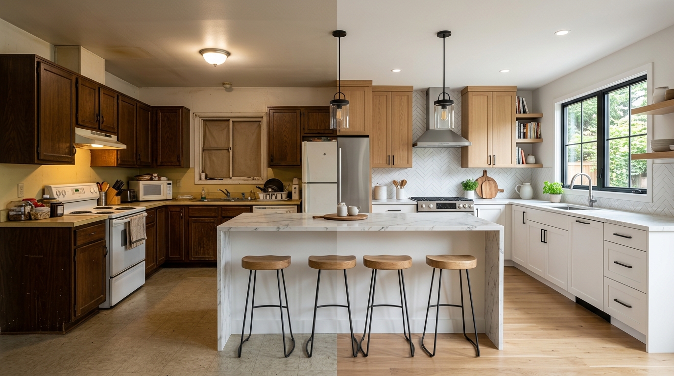
A kitchen remodel before and after is not just about what the finished kitchen looks like. It is about understanding what specific changes produced the most dramatic results and why certain transformations work so much better than others despite similar budgets. These 17 kitchen remodel before and after ideas cover the most impactful changes real kitchens go through, from full gut renovations to targeted upgrades that change everything without touching the structure.
Every idea here is grounded in the specific before condition that made the after so effective. Understanding both sides of the transformation is what makes these ideas genuinely useful rather than just aspirational. Below are 17 before and after kitchen remodel ideas that deliver real, visible results.
1. Dark Oak Cabinets to Painted White Shaker
Before: Dark honey oak cabinets with a heavy wood grain, builder grade brass hardware, and a dated laminate countertop that absorbed the darkness of the cabinets and made the kitchen feel perpetually dim regardless of how much light the room received. The oak grain pattern competed visually with every other surface in the kitchen and the warm orange tone of the wood had no relationship to the flooring, the backsplash, or the countertop materials around it.
After: The same cabinet boxes painted in a clean white with new shaker style door fronts replacing the flat or raised panel oak originals, matte black hardware replacing the brass, and a light quartz countertop replacing the laminate. The transformation addresses every visual problem of the before simultaneously: the darkness is gone, the dated material is gone, the disconnected color relationship is gone. Painting existing cabinet boxes rather than replacing them entirely is what makes this transformation achievable at a fraction of full cabinet replacement cost and the result is indistinguishable from new cabinetry to most observers.
2. Dropped Ceiling Removed to Expose Original Height
Before: A kitchen with a dropped ceiling installed in the 1970s or 1980s that reduced the ceiling height to eight feet or less and concealed the original ceiling structure above it. Dropped ceilings were installed to hide outdated plumbing and electrical work and to improve insulation in an era before better solutions existed. The low ceiling compressed the kitchen visually and made the space feel smaller than its floor plan justified.
After: Dropped ceiling removed to reveal the original ceiling height, which in most homes built before 1970 is nine to ten feet or higher. The additional ceiling height changes the proportions of the kitchen completely and creates a sense of space that no amount of cosmetic work on the lower half of the kitchen achieves. New lighting is installed at the original ceiling height, upper cabinets are extended to ceiling height to eliminate the dust collecting gap above them, and the kitchen reads as a genuinely different room despite no changes to the floor plan or the cabinet layout.
3. Galley Kitchen Wall Removed to Open Plan
Before: A closed galley kitchen separated from the living and dining area by a full load bearing or non load bearing wall. The enclosed galley format isolated the cook from the rest of the household during meal preparation and made the kitchen feel narrow, dark, and disconnected from the social life of the home despite the galley being a genuinely efficient cooking layout in terms of workflow.
After: Non load bearing wall removed entirely or load bearing wall replaced with a structural beam that opens the kitchen to the adjacent living or dining space. The galley cabinet layout remains intact on both sides because the galley workflow is genuinely efficient but the removal of the separating wall floods the kitchen with borrowed light from the adjacent room and integrates the cook into the household activity during meal preparation. The before and after of a galley wall removal is one of the most dramatic spatial transformations available in a kitchen remodel because the change is structural rather than cosmetic and structural changes produce results that paint and hardware cannot approximate.
4. Laminate Countertops to Quartz
Before: Laminate countertops in a dated pattern, whether the beige speckle of the 1990s, the green marble print of the 1980s, or the brown woodgrain of the 1970s, that had reached the end of their usable life with visible edge lifting, heat damage, and a surface that no longer cleaned to a satisfying finish regardless of the products used. Laminate countertops at the end of their life make an entire kitchen look dated and tired even when the cabinets, the appliances, and the flooring are in good condition.
After: Quartz countertops in a light neutral tone with subtle veining installed on the same cabinet bases with no other changes to the kitchen. The countertop replacement alone, without touching the cabinets, the backsplash, the flooring, or the appliances, produces a before and after result that most people cannot believe came from a single change. The quality of the new surface material changes how every adjacent element reads because the fresh, premium countertop makes the surrounding kitchen elements look intentional rather than accumulated.
5. No Backsplash to Full Height Tile
Before: A kitchen with painted drywall behind the countertops in the gap between the counter surface and the upper cabinets. Painted drywall in a kitchen is a practical compromise that absorbs grease, cooking splatter, and steam over time and becomes progressively more difficult to clean to a satisfying finish. The absence of a tile or stone backsplash also leaves the kitchen looking unfinished in the most active and most viewed wall section of the entire room.
After: Full height tile backsplash installed from the counter surface to the underside of the upper cabinets, or in kitchens without upper cabinets, continuing to the ceiling. The tile choice determines the personality of the transformation: classic white subway tile produces a clean and timeless result, a bold patterned cement tile produces a dramatic statement, and a large format stone look porcelain produces a premium material quality. The before and after of a backsplash installation is one of the highest return per square foot improvements available in a kitchen remodel because the backsplash zone is small in area but centrally important in visual terms.
6. Builder Grade Lighting to Layered Custom Lighting
Before: A single flush mount ceiling light centered in the kitchen providing flat, even illumination across the entire room without differentiation between the task lighting needed at the counter and the ambient lighting appropriate for the rest of the space. Builder grade flush mount fixtures in a brushed nickel or bronze finish that were chosen to be inoffensive rather than to make any particular statement about the character of the kitchen.
After: A complete lighting replacement that introduces three distinct lighting layers: recessed LED downlights positioned specifically over counter work zones for task illumination, pendant lights hung above the island at the correct height for both task and ambient use, and under cabinet LED strips mounted to the underside of upper cabinets to illuminate the counter surface directly below them. The before and after of a layered kitchen lighting installation is most dramatic in the evening when the difference between a single overhead source and a thoughtfully layered scheme is the difference between a kitchen that looks institutional and one that looks genuinely designed.
7. Standard Cabinets to Ceiling Height Cabinets
Before: Standard height upper cabinets that end twelve to eighteen inches below the ceiling, leaving a gap above them that accumulates dust, requires items stored there to be retrieved with a step stool, and creates a horizontal line across the upper kitchen that visually caps the space and prevents the eye from traveling upward to the full ceiling height. The gap above standard height cabinets is the most consistently regretted feature of kitchens installed before homeowners understood what ceiling height cabinetry does for the proportion of a kitchen.
After: Upper cabinets extended to the ceiling either through replacement with taller cabinet boxes or through the addition of a second stacked cabinet unit above the existing uppers. The ceiling height cabinets eliminate the dust accumulating gap, provide significantly more storage, and change the visual proportion of the kitchen completely by allowing the cabinetry to use the full wall height available. The kitchen reads as more generous, more custom, and more considered simply because the cabinets go all the way up rather than stopping arbitrarily at a standard height.
8. Outdated Tile Floor to Large Format Porcelain
Before: Small format ceramic tile in an outdated color or pattern, whether the beige and brown diagonal of the 1980s, the cream and green checkered pattern of the 1990s, or the terracotta and black border tile of the early 2000s, with grout lines that had absorbed decades of kitchen spills and resisted every cleaning product applied to them. Small format tile with multiple grout lines makes a kitchen floor look busy and dated regardless of how clean the grout actually is.
After: Large format porcelain tile in a 24×24 or larger format installed with minimal grout lines in a warm white, light gray, or natural stone look finish. The reduction in grout line frequency alone makes the floor look significantly cleaner and more contemporary and the larger tile format makes the kitchen floor read as more expansive than the same floor covered in smaller tiles. The before and after of a floor tile replacement is one of the more involved kitchen remodel projects because furniture and appliances must be moved and the kitchen is out of service during installation but the transformation it produces is among the most complete available in terms of changing the perceived age and quality of the kitchen.
9. Hollow Core Pantry Door to Solid or Glass Panel
Before: A hollow core interior door on the kitchen pantry in a flat panel finish painted the same white as the surrounding walls, making it visually disappear into the kitchen in a way that neither celebrated the pantry’s presence nor made any design statement about it. Hollow core doors have a lightweight, insubstantial quality that communicates budget construction regardless of what surrounds them and a pantry door that reads as an afterthought affects the perceived quality of the whole kitchen.
After: Hollow core door replaced with either a solid wood panel door in a finish that complements the cabinet color, a glass panel door that reveals the organized pantry interior as a display element of the kitchen, or a barn door on a surface mounted rail that adds both function and a design feature to the kitchen wall. The pantry door replacement is one of the smaller scale before and after transformations on this list but the improvement in perceived kitchen quality it delivers is disproportionate to the cost and complexity of the change.
10. Closed Kitchen to Pass Through Window
Before: A kitchen with a solid wall separating it from the dining room or living area with no visual or physical connection between the two spaces. The cook in this kitchen worked in complete isolation from household activity during meal preparation and serving food to the adjacent dining room required carrying dishes around the wall through a doorway, which is inefficient for everyday meals and genuinely inconvenient during entertaining.
After: A pass through window cut into the wall between the kitchen and the dining area with a counter surface on both sides that serves as a serving ledge from the kitchen and a bar or casual dining surface from the dining room side. The pass through window costs a fraction of a full wall removal and delivers many of the same benefits: visual connection between the kitchen and adjacent room, natural light sharing between the two spaces, and a serving function that makes entertaining and everyday meal service significantly more fluid. The before and after is particularly striking because the structural change is relatively minor but the functional and visual improvement is immediate and significant.
11. Stock Cabinets to Semi Custom with Crown Molding
Before: Builder grade stock cabinets in a standard box size installed without crown molding, light rail molding, or any of the architectural details that distinguish a custom or semi custom kitchen from a basic box store installation. Stock cabinets installed without molding details have a flat, unfinished quality at the top and bottom edges that makes the cabinetry look like it was chosen for availability rather than for design intent.
After: The same stock cabinet boxes upgraded with crown molding at the ceiling junction, light rail molding at the bottom of the upper cabinets, furniture feet on the base cabinets, and glass inserts in one or two upper cabinet doors. None of these additions require replacing the cabinet boxes and all of them are achievable as DIY projects with basic woodworking tools. The before and after of a stock cabinet upgrade with molding details is one of the highest return low cost kitchen transformations available because the molding costs a fraction of new cabinetry while producing a result that most observers assume required full cabinet replacement.
12. White Appliances to Stainless or Panel Ready
Before: White appliances installed in the 1990s or early 2000s that were in full working order but whose color and finish read as dated in a kitchen that had otherwise been updated. White appliances occupy an unusual position in kitchen design because they were the premium finish choice through most of the 1980s and 1990s and became associated with dated kitchens only as stainless steel emerged as the dominant premium finish in the 2000s. A kitchen with updated cabinetry, a new countertop, and a fresh backsplash that still contains white appliances reads as partially remodeled rather than complete.
After: White appliances replaced with stainless steel versions that match the current finish language of the kitchen hardware and fixtures, or with panel ready appliances that disappear behind cabinet door panels for a fully integrated look. The appliance replacement is the most expensive individual item on this list but it is also the change that most completely updates the perceived age of the kitchen because appliance design evolves quickly and the finish and form of appliances communicates the decade of installation more legibly than almost any other kitchen element.
13. Cramped Breakfast Nook to Extended Island Seating
Before: A built in breakfast nook in a corner of the kitchen that occupied significant floor area, was difficult to clean under and around, seated fewer people than the footprint justified, and created a circulation problem in the kitchen because the corner it occupied was needed as a traffic path during meal preparation. Built in breakfast nooks were a popular kitchen feature through several decades and many kitchens contain them in locations that made sense in the original floor plan but create flow problems in how the kitchen is actually used today.
After: Breakfast nook removed and the floor plan reconfigured to extend the kitchen island or add a new island that provides equivalent or greater seating capacity with a smaller footprint, better integration into the kitchen workflow, and a seating arrangement that faces into the kitchen rather than into a corner. The before and after of this transformation is both spatial and functional: the kitchen gains circulation space, the cook gains social connection to the people eating, and the seating capacity typically increases while the furniture footprint decreases.
14. Single Sink to Farmhouse Apron Front
Before: A standard stainless steel drop in single or double basin sink in an undermount or top mount installation that was functional but visually unremarkable and completely anonymous in terms of its contribution to the character of the kitchen. The standard sink is one of those kitchen elements that most people do not notice until it is replaced with something that makes a genuine design statement, at which point the improvement is immediately and unanimously appreciated by everyone who uses the kitchen.
After: A farmhouse apron front sink in white fireclay or stainless steel installed in the same counter position with the cabinet below modified to accommodate the exposed apron front. The farmhouse sink changes the visual weight and the character of the sink area completely and its presence is felt throughout the kitchen because the apron front is visible from the dining area and from anywhere in the open plan living space adjacent to the kitchen. The before and after of a farmhouse sink installation is one of the most photographed kitchen remodel transformations because the visual difference between a standard drop in sink and a farmhouse apron front is immediate, significant, and appreciated by virtually everyone who encounters the finished kitchen.
15. Outdated Laminate Flooring to Engineered Hardwood
Before: Laminate flooring in a kitchen installed in the 2000s in a wood look pattern that has since become associated with that specific decade through its scale, color, and the slight artificiality of its grain pattern. Laminate flooring that was installed to simulate wood but is now recognizable as laminate from a distance creates a floor that reads as a compromise rather than a considered material choice and that pulls the perceived quality of the kitchen below what the cabinetry, countertops, and appliances around it justify.
After: Engineered hardwood flooring in a white oak or light maple in a wider plank format installed over the existing subfloor in most cases, since engineered hardwood can float over many existing floor surfaces without full removal of the laminate below. The warmth, the genuine wood grain variation, and the natural imperfection of real wood flooring transforms the base plane of the kitchen in a way that makes every element above it read as more grounded and more considered. The before and after of this flooring replacement is most apparent in photographs because the camera captures the difference between a surface that has genuine material depth and one that is simulating it.
16. No Hardware to Statement Pulls Throughout
Before: A kitchen with cabinets that had no hardware at all, relying on push to open mechanisms or finger pulls routed into the door edge. Kitchens with no visible hardware have a clean, minimal quality that was very deliberately chosen through the 2010s as the hardware free look represented a certain kind of restrained contemporary aesthetic. In many kitchens however the hardware free look has aged poorly because the push to open mechanisms wear out, the finger pull routing collects grease, and the absence of hardware makes the cabinets look unfinished rather than intentionally minimal.
After: Statement hardware installed throughout the kitchen in a single finish and a single form chosen to complement the cabinet style and color. Long bar pulls in matte black on white shaker cabinets, unlacquered brass cup pulls on navy cabinets, or brushed nickel bin pulls on gray cabinets all produce a before and after result that is remarkable for how completely a relatively inexpensive hardware change transforms the perceived character and finish quality of the cabinetry. Hardware is the jewelry of the kitchen cabinet and its presence or absence communicates intentionality as directly as any other design decision in the room.
17. Cluttered Open Shelving to Organized Display with Consistent Vessels
Before: Open shelving in a kitchen that had accumulated a disorganized collection of mismatched dishes, random decorative objects, orphaned pantry items, and the general overflow of a kitchen without enough closed storage. Open shelving in this condition reads as clutter elevated to eye level and the visual disorder it creates makes the entire kitchen feel less organized and less considered than the same kitchen with the shelving contents hidden behind closed cabinet doors.
After: The same open shelving cleared entirely and restocked with a curated, consistent collection of vessels and objects: a complete set of matching white ceramic dishes stacked by type, a row of clear glass jars holding dry goods in consistent sizes, two or three plants in matching terracotta pots, and one or two genuinely beautiful objects that contribute character without creating clutter. The before and after of an open shelving organization and curation project is purely editorial rather than structural but the visual transformation it produces is as dramatic as many much more expensive remodel interventions because the shelving content is one of the most visually prominent elements in the kitchen and its quality of organization is visible from every point in the room.
Final Thoughts
The most effective kitchen remodel before and after transformations are rarely the most expensive ones. The projects on this list that produce the most dramatic results, the ceiling height cabinet extension, the backsplash installation, the hardware replacement, and the open shelving curation, are among the more accessible remodel investments available and their impact comes from addressing the specific visual problems of the before condition precisely rather than from the scale of the budget applied to them.
Identify the two or three before conditions in your own kitchen that bother you most every day and start there. The best kitchen remodel before and after story is always the one that solves the problems that actually affected how you felt about your kitchen every morning rather than the one that addressed the most surface area for the most money.